
Liquidity & Market Structure: Identifying the Regimes That Drive Returns
Why liquidity doesn’t predict direction — but defines risk, behaviour, and outcomes

Part of The Technical Edge — Market Structure Series
If you’re new here, I break down markets using structure, volatility, sector rotation, and cross-asset signals.
→ New here? Start here
→ My framework (how I analyse markets)
Introduction: Liquidity as the Hidden Driver
“Liquidity doesn’t tell you where the market is going; it tells you how much ‘oxygen’ is in the room while it gets there.”
Most market participants focus on direction — uptrend vs downtrend.
But direction alone is incomplete.
The same trend behaves very differently depending on the underlying liquidity environment:
Strong trends can persist in tight liquidity
Weak trends can accelerate in loose liquidity
Risk does not come from direction — it comes from instability within the regime
This report focuses on how liquidity regimes shape asset behaviour — not on predicting market direction.
Framework Overview
This analysis moves through four layers:
Environment — how liquidity shapes behaviour
Impact — how returns change across regimes
Risk — where losses concentrate
Application — how to position accordingly
1. Liquidity Regimes & Asset Behaviour
The first step is understanding how major asset classes behave across different liquidity environments.
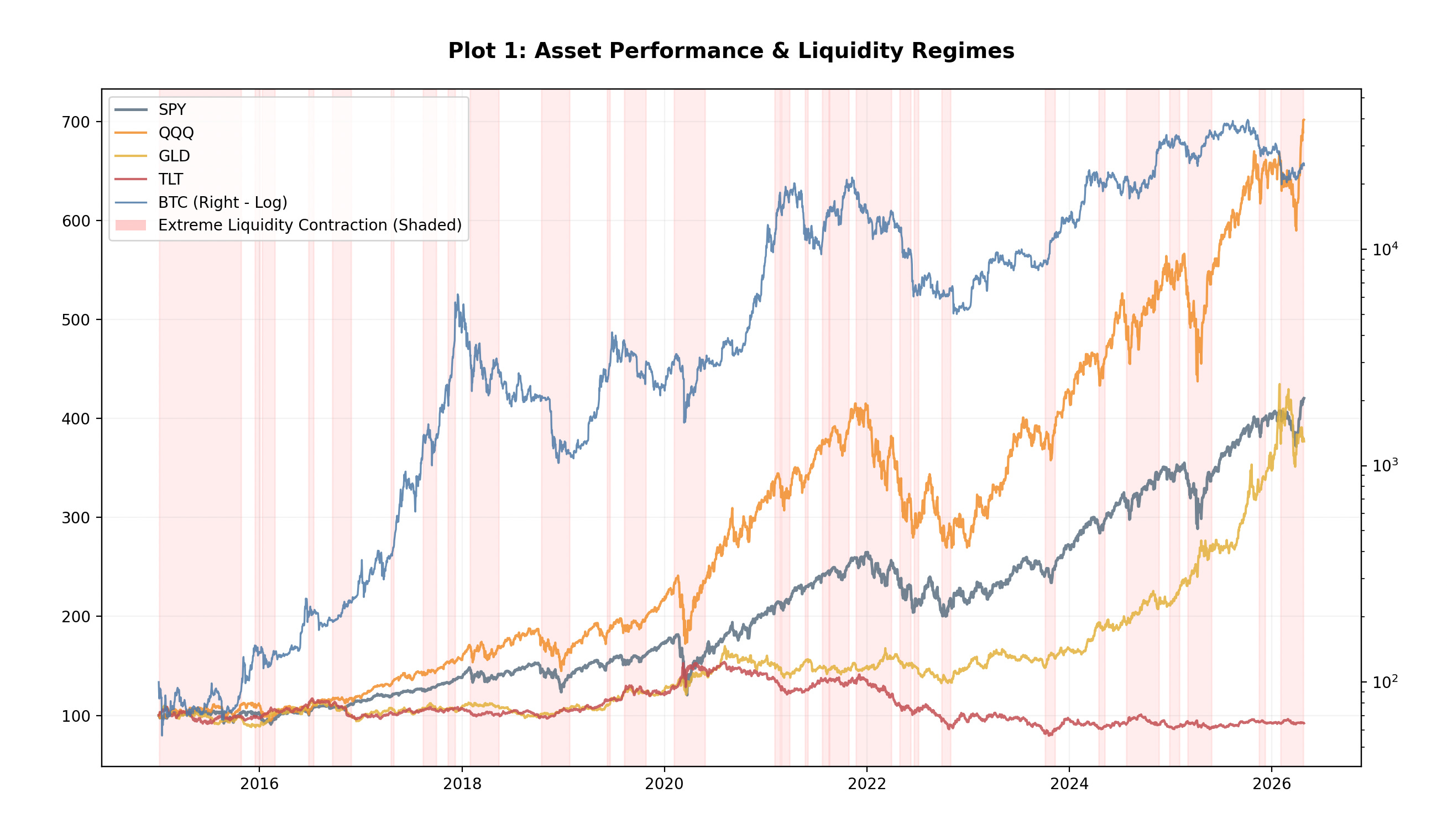
TL;DR: Liquidity doesn’t stop trends — it determines how stable they are.
Key Observations
Equities (SPY, QQQ) continue trending over time
Bitcoin shows the highest sensitivity to liquidity shifts
Gold remains relatively stable across regimes
Bonds (TLT) weaken structurally during tightening cycles
Liquidity does not act as a directional signal.
It acts as a stability filter.
2. Correlation Regimes: When Diversification Breaks
The next step is examining how cross-asset correlations evolve in response to liquidity conditions.
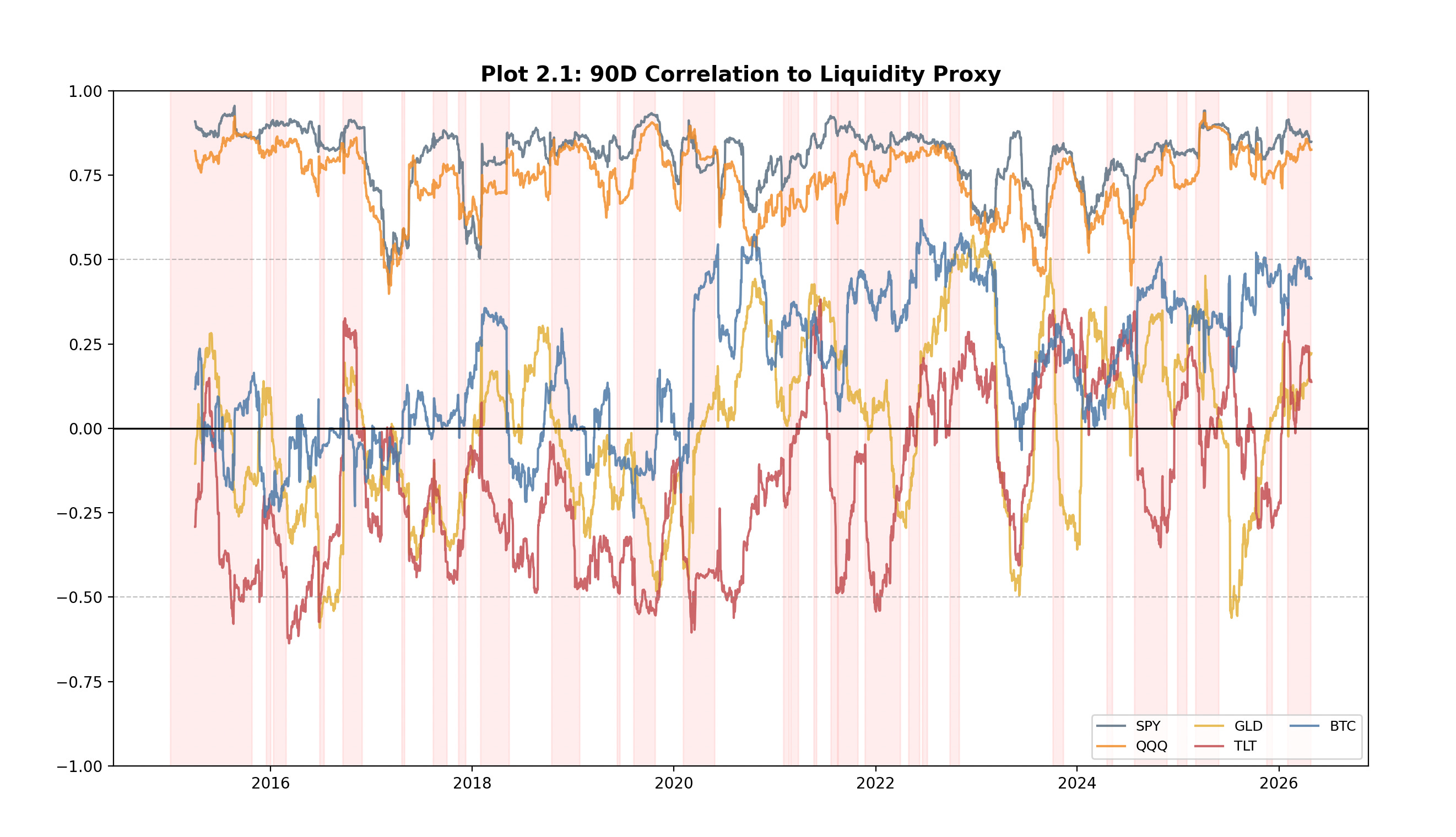
TL;DR: Correlations rise during tightening — diversification breaks when it’s needed most.
To validate this, correlations are then measured relative to equities as the primary market anchor.
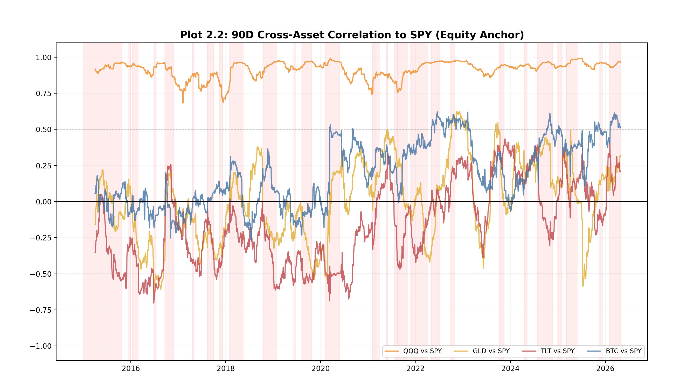
TL;DR: Cross-asset correlations converge toward equities in tight liquidity — diversification breaks when it’s needed most.
Key Observations
Equities maintain structurally high correlation
Bitcoin has transitioned toward equity-like behaviour in recent regimes
Gold offers conditional diversification, improving mainly during stress
Bonds show unstable correlation and cannot be relied on as a consistent hedge
During tightening phases, correlations compress — signalling a shift from diversification to systemic risk.
In stable conditions, diversification works.
In tight liquidity, everything trades as one.
3. Return Profiles by Liquidity Regime
Rather than focusing on price, we analyse forward returns conditioned on liquidity regimes.
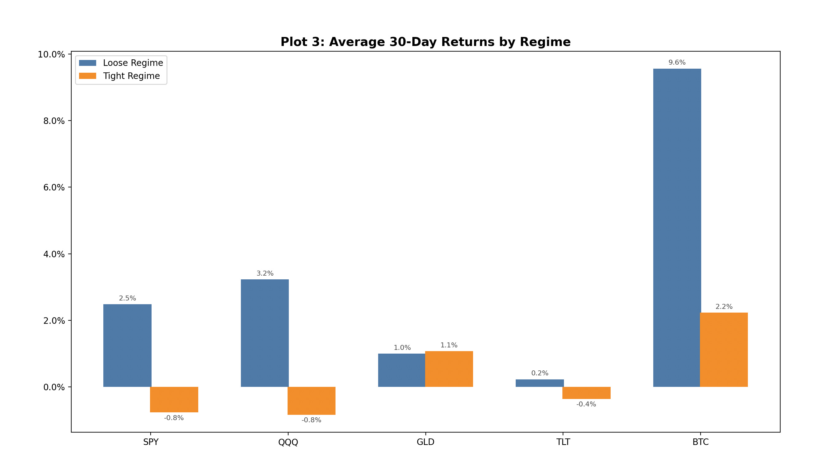
TL;DR: Returns compress in tight liquidity — upside narrows while variability increases.
Key Observations
Loose liquidity supports stronger forward returns
Tight liquidity compresses returns significantly
Bitcoin delivers the highest upside in loose conditions
Gold remains relatively stable
Bonds show limited upside
Liquidity does not eliminate returns —
it compresses opportunity and increases variability.
4. The Macro Matrix: Liquidity × Volatility
Liquidity alone is not sufficient.
The interaction between liquidity and volatility defines the true market regime.
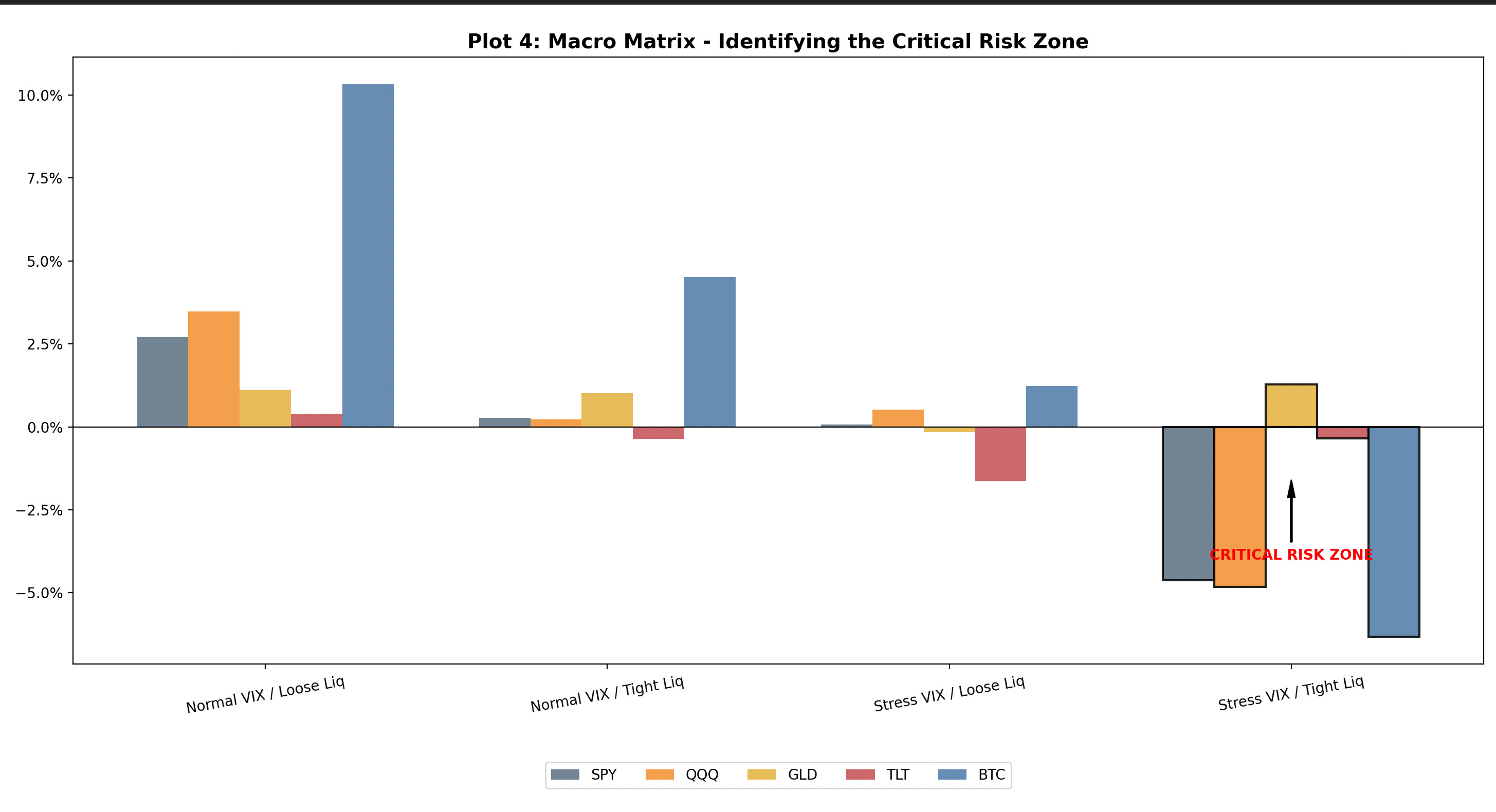
TL;DR: The Stress + Tight Liquidity regime is the only environment where equities consistently deliver negative returns.
The Dashboard Strategy
Each regime implies a different approach to risk:
The Goldilocks Regime (Normal VIX + Loose Liquidity)
→ High conviction environment
→ Trend-following works
→ Higher beta exposure can be deployed
The Grind Regime (Normal VIX + Tight Liquidity)
→ Slower, more selective market
→ Reduced position sizing
→ Focus on stronger structures only
The Transition Regime (Stress VIX + Loose Liquidity)
→ Unstable / transitional
→ Avoid aggressive positioning
→ Wait for confirmation
The Abyss Regime (Stress VIX + Tight Liquidity)
→ Defensive environment
→ Capital preservation priority
→ Cash / hedges over directional risk
The regime defines not just expected returns —
but how aggressively risk should be taken.
Current Regime — Grind
A slower, more selective environment where trend quality deteriorates and opportunity narrows.
Key Observations
Goldilocks → strongest and most stable returns
Grind → slower but still constructive
Transition → mixed, unstable behaviour
Abyss → consistent negative outcomes
This final regime represents the critical risk zone:
Equities turn negative
Bitcoin underperforms sharply
Gold becomes defensive
Correlations rise
Most market mistakes come from applying the right strategy in the wrong regime.
5. Drawdowns Are Regime-Driven
Drawdowns are not random events — they cluster within specific liquidity conditions.
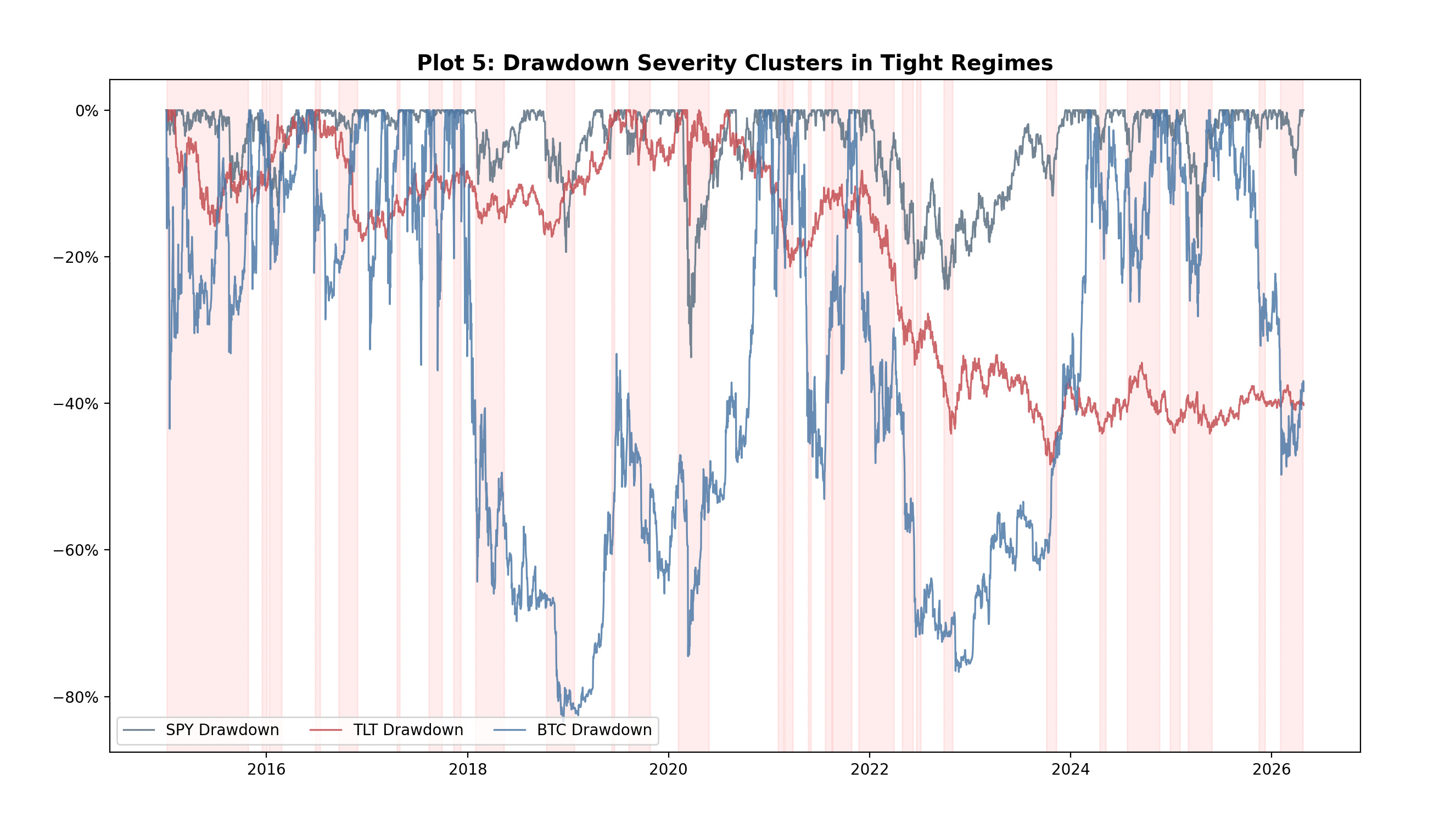
TL;DR: Drawdowns cluster in tightening regimes — risk is conditional, not random.
Key Observations
Severe drawdowns consistently align with tight liquidity periods
Bitcoin experiences the deepest drawdowns
Equities show consistent clustering of declines
Bonds trend structurally lower rather than sharply correcting
Liquidity contraction reduces the market’s ability to absorb selling pressure.
6. Lead–Lag Analysis: Does Liquidity Predict Markets?
A common assumption is that liquidity leads asset prices.
The data suggests otherwise.
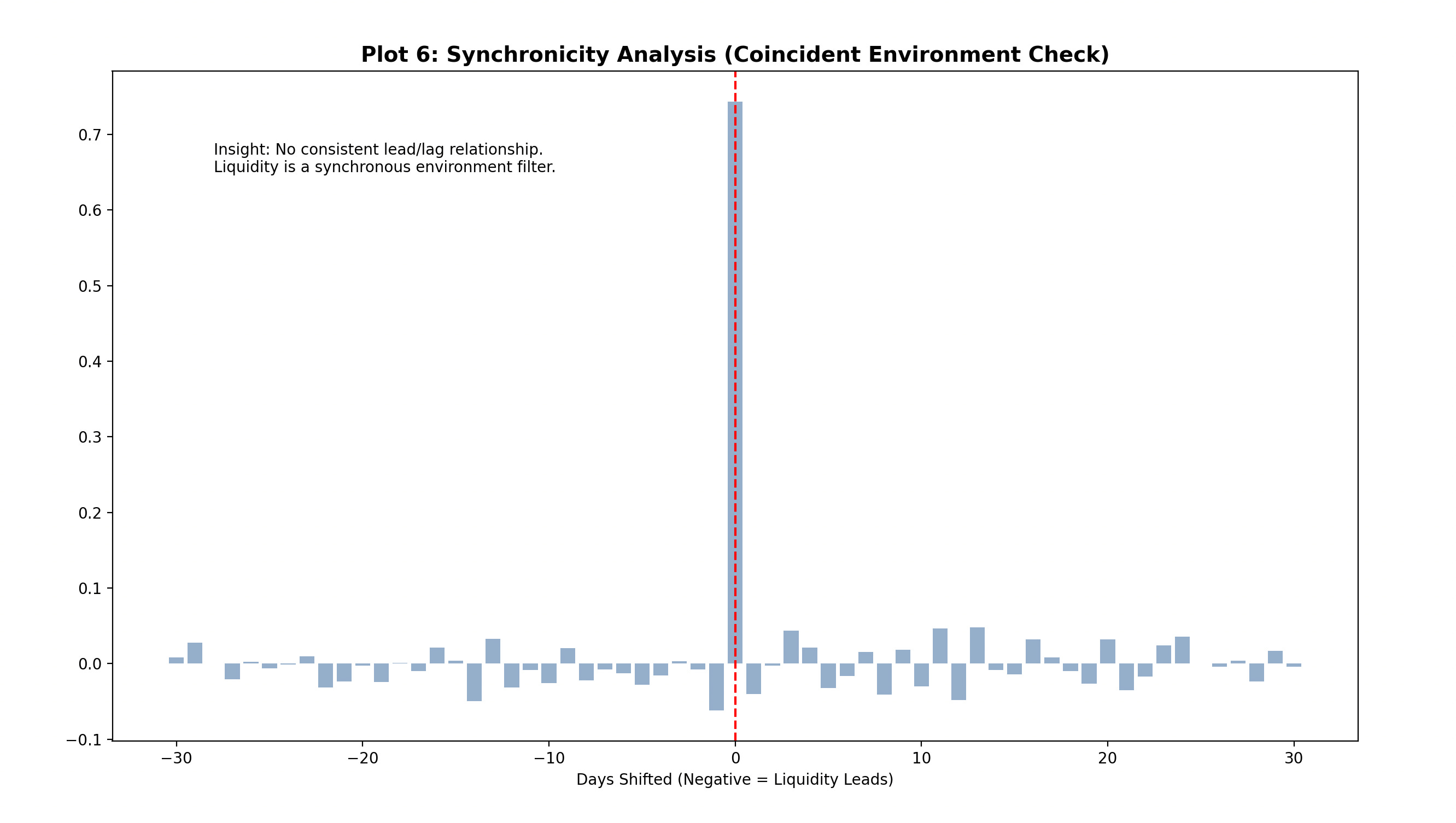
TL;DR: No reliable lead/lag — liquidity is coincident, not predictive.
Key Insight
No consistent lead/lag relationship exists
Correlations peak around zero lag
Liquidity behaves as a coincident variable
This is what makes liquidity useful —
not for prediction, but for context.
Key Takeaways
Liquidity defines market conditions, not direction
Tight liquidity compresses returns and increases instability
Correlations rise as liquidity tightens
The highest risk occurs during tight liquidity + high volatility
Drawdowns cluster in tightening regimes
Liquidity is coincident, not predictive
Where This Goes Next
This framework will evolve into a Weekly Liquidity & Regime Dashboard within the Weekly Market Report.
Each week, this will define:
The current regime
The interaction between liquidity and volatility
The expected behaviour profile
The next step is not understanding the model —
it’s applying it in real time.
Subscribe
If you find this useful, consider subscribing to The Technical Edge.
Each week, I break down:
Market structure and regime shifts
Sector rotation and leadership
Cross-asset signals
Actionable setups based on environment
No noise. Just process.
Disclaimer
This report is for informational and educational purposes only and should not be considered investment advice. Markets involve risk, and investors should conduct their own research or consult a financial professional before making investment decisions.
The "Grind" regime diagnosis is consistent with current TAA positioning: equities remain ranked first at 61.5% overweight, but the trend signal is down, and bonds sit at rank four with 42.5% underweight and a rising trend. That combination reads exactly as the article describes: compressed opportunity, deteriorating trend quality, and bonds offering no reliable hedge.
UBP notes that "geopolitical events have triggered significant reversals in recent price trends, as asset prices are temporarily driven by technical factors, such as investors requiring liquidity and/or risk controls, leading to automatic position selling," a mechanism that amplifies regime transitions from Grind toward Abyss. UBP, Asset Allocation Award winner 2026.
The critical risk is that coincident liquidity signals provide no advance warning of the shift into the Abyss regime. What specific cross-asset signal in your framework would confirm that transition with the shortest lag?